Working with Blocks
Working with Blocks
Blocks are the building units of Sameness. Each page is made by stacking and arranging blocks that follow your brand system. See how it works
Adding Blocks
Blocks are the foundation of every page in Sameness.
You build by stacking them, clean, modular, and fully flexible.
To add a block:
1. Open the Block Library on the left side of the editor.
2. Drag a block you want to use.
3. Drop it onto the canvas where you want it to appear.
4. The block snaps into place instantly.
5. The left panel opens with all the settings and inputs for that block.
From here, you can start adjusting content, layout, spacing, and color and see every change update live on the canvas.Block Library
Guideline Block Library
The Block Library is where you choose what kind of content you’re adding to a page. Blocks are organised into three groups: Basics, Brand Strategy, and Visual Identity.
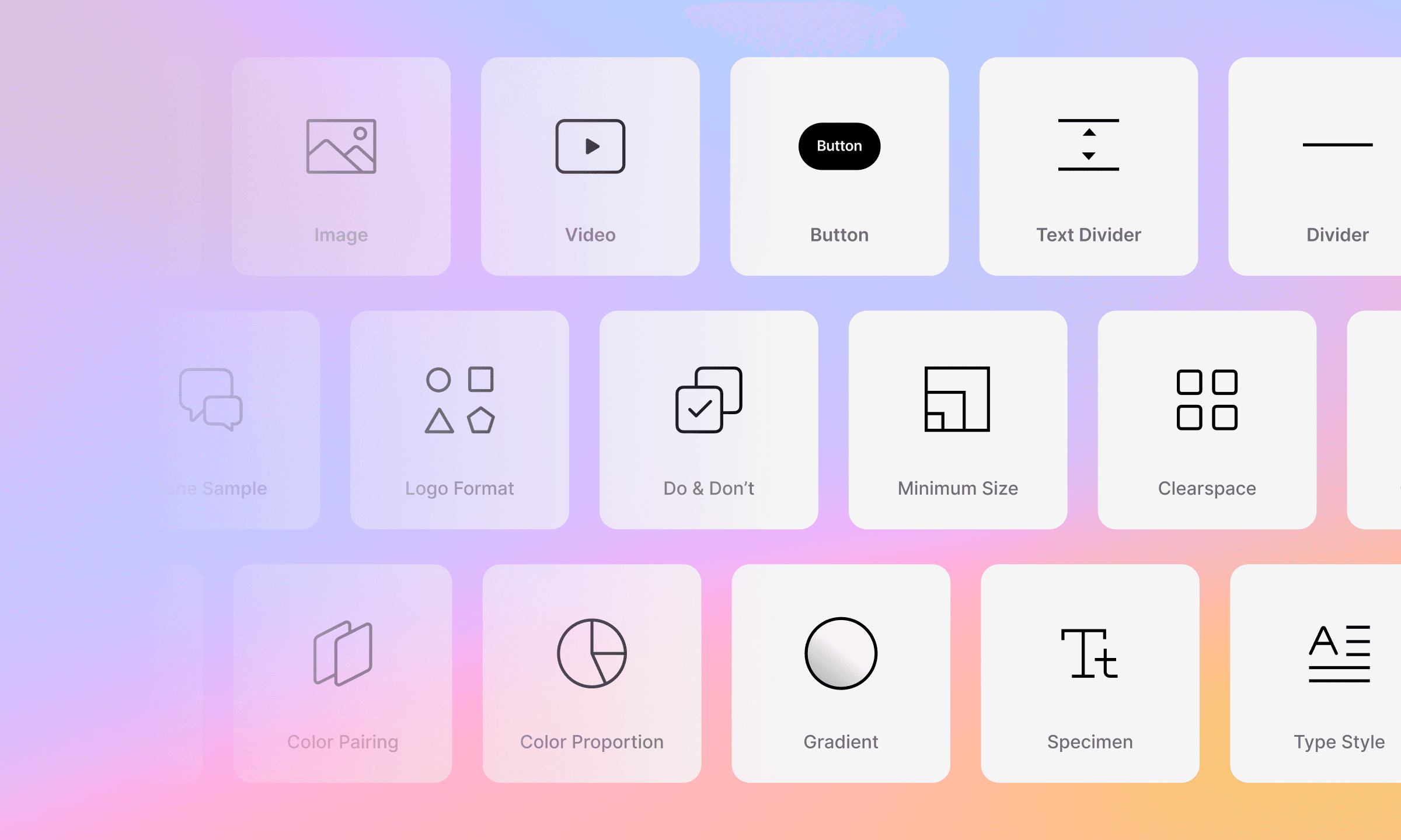
Basics Blocks
Everyday building blocks you’ll use across most pages. Use these to structure content, add media, create actions, and control reading flow.
Dynamic Text
Simple Text
Image
Video
Button
Text Divider
Divider
Asset Download
Anchor (watch detailed walkthrough)
Brand Strategy Blocks
Blocks designed to hold the thinking behind your brand. These are ideal for your strategy, positioning, and messaging sections.
Vision & Mission
Core Value
Tone of Voice
Tone Sample
Visual Identity Blocks
Blocks that document and demonstrate how your brand looks and behaves. Use these to build a complete visual system from logos and color to type, motion, and usage rules.
Logo Format
Do & Don’t
Minimum Size
Clearspace
Construction
Partnership
Color Palette
Color Pairing
Color Proportion
Gradient
Typeface
Typeface (Multiple)
Specimen
Type Style
Alternate
Motion Principles
Supers
Once you know where each group lives, you can pick what you need as you build.
Block Customizations
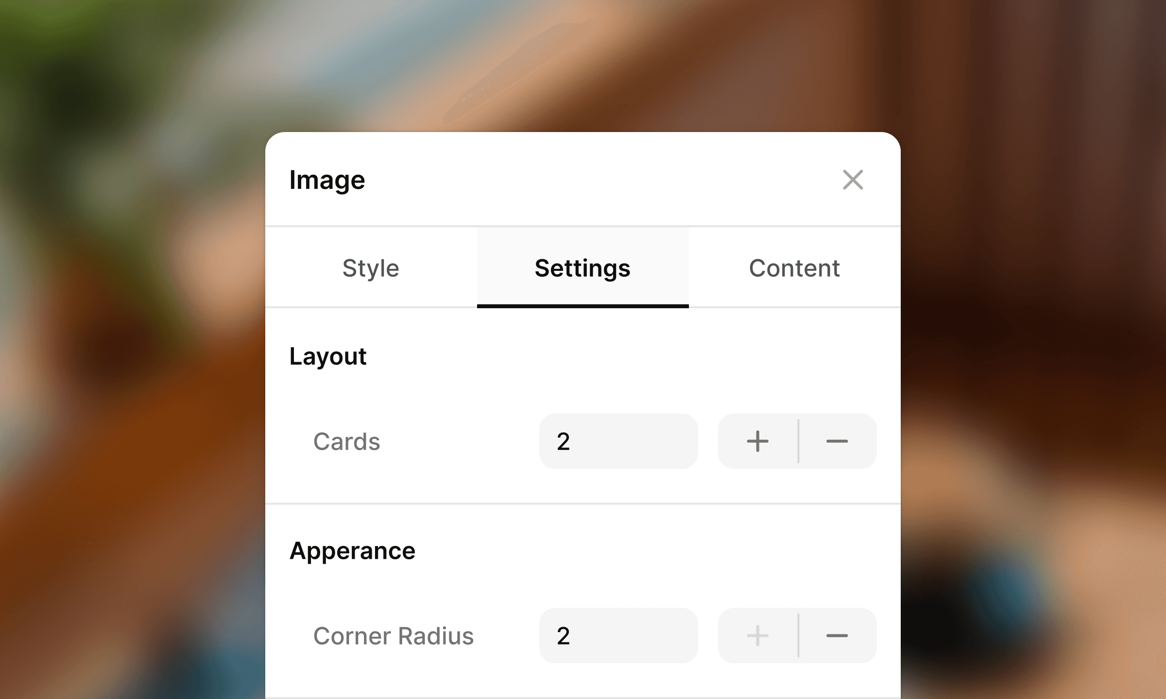
Every block in Sameness follows a consistent structure.
When you select a block, you’ll see three panels, Style, Settings, and Content.
Once you understand these, you can work with any block in the system.
Style
The Style tab handles the section-level design.
This is where you shape the overall container that the block sits in.
You’ll typically find:
Background color
Top and bottom padding
Responsive padding (tablet and mobile)
These options help you control spacing, hierarchy, and rhythm across your page.
Settings
The Settings tab manages structure and appearance.
Depending on the block, this may include:
Layout options (e.g., number of cards, alignment)
Appearance controls (corner radius, spacing rules, color styling)
Variants specific to the block type
This is where the block behaves differently depending on its purpose.
Simple blocks have minimal options; more advanced blocks will expose deeper controls.
Content
The Content tab is where you input the actual information.
Common inputs include:
Titles
Captions
Images or uploads
Repeater fields (e.g., multiple cards or items)
Visibility toggles (show/hide specific elements)
If a block displays anything meaningful, text, icons, swatches, logos. You’ll manage it here.
Block Complexity
Most blocks follow the same three-panel structure. Some will show fewer inputs, depending on how simple the block is.
Rearranging Blocks
You can adjust the order of your content at any time. Blocks move cleanly without affecting anything you’ve already designed.
The quick block panel consists of:
Move Up / Move Down: Use this to shift the block up and down through the layout.
Duplicate: Create a copy of the block, including all styling and content so you can reuse layouts quickly.
Delete: Remove the block from the page when you no longer need it.
Edit: Open the block’s panel to update its Style, Settings, or Content.
Best Practices
Blocks give you flexibility, but a few habits help you build faster and keep your pages consistent.
Use Global Styles as your foundation
Set typography, colors, and elements once. Rely on them instead of styling block-by-block.
Consistency comes from the system, not manual tweaks.
Start with the sample data
Sameness includes ready-made sample pages and blocks. Use them as starting points: duplicate, swap content, and adapt to your brand.
It’s one of the quickest ways to build a complete guideline without starting from zero.
Duplicate instead of rebuilding
If a layout already works, duplicate it. You keep spacing, structure, and hierarchy intact while speeding up your workflow.
Preview often
Check your page in Preview to catch spacing or alignment issues. It’s the fastest way to see the page the way your users will.