Global Styles
Organizing the guidelines
The Global Style Engine defines the visual language of your entire brand system.
Set your typography, colors, and core components once. Sameness applies them consistently across every page and block. It’s the foundation of how your brand looks and feels.
How to Access the Global Styles
You can open Global Styles in two ways:
From the Dashboard: Go to the Global Styles tab and click Set Up Global Styles.
From the Page Editor: Click Global Styles in the top toolbar while designing a page.
Both options open the same interface.
What You Can Define
The Global Style Engine is divided into three sections: Type, Colors, and Elements.
Type
Build your full typography system, the backbone of your visual identity.
You can define the following type styles that's applied across blocks:
Header Large
Header
Eyebrow
Title
Subtitle
Caption
Label
Choose from your uploaded fonts, adjust font sizing, weight, and spacing, and preview changes instantly.
A consistent type system keeps your entire guideline aligned. Watch detailed walkthrough
How Type Styles Connect to Blocks
Each text field inside a block is tied to a specific type style in your Global Styles. This makes it easy to understand exactly what you’re changing.
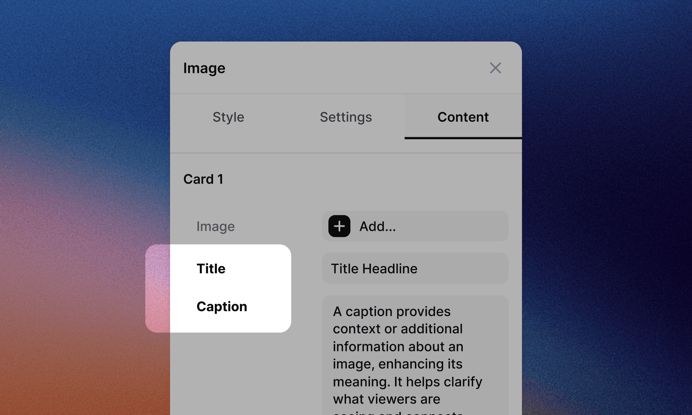
If a block shows inputs labeled Title and Caption, the Title and Caption type styles in Global Styles control how they appear.
When you update a type style’s size, weight, or spacing, every block that uses that style updates automatically.
This keeps your typography consistent across the entire system without needing to restyle blocks one by one.
Colors
Set up your Global Color Palette, the essential hues that represent your brand.
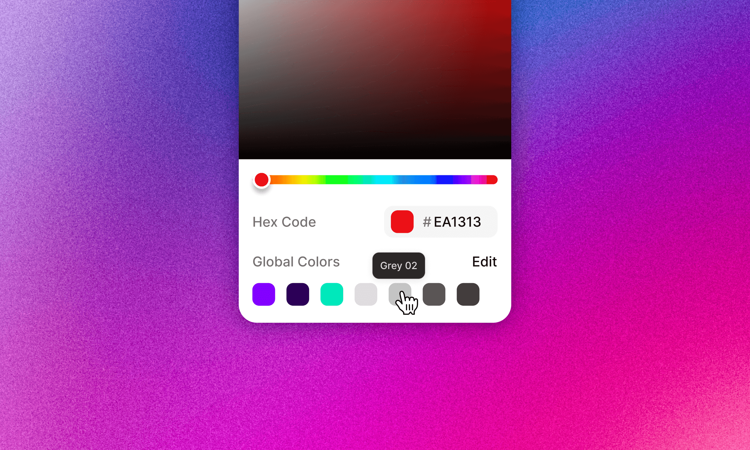
Once added, these colors appear throughout Sameness anywhere a color picker exists, always surfaced as Global Colors. Watch detailed walkthrough
No retyping hex codes.
No mismatched swatches.
Everything stays consistent by default.
Elements
Style the interactive components used throughout your guidelines.
You can define:
Buttons
Toggles
Tabs
Anchors
Do & Don’ts
Tone Sample Cards
Control default and active states, color behavior, and core styling. Changes update in real time, so once you save and return to the page editor, you’ll see the impact immediately. Watch detailed walkthrough