Inside Google’s new look: more than just a gradient
Google didn’t just update its logo. It redefined how a global brand signals intelligence, integration, and humanity in the AI age.
In May 2025, the world’s most recognizable tech company introduced its first major logo redesign in a decade. At a glance, the change felt minimal, subtle gradients replacing four color blocks in the iconic “G.” But look again, and the design reveals its intent: this isn’t a refresh. It’s a reset.
This is Google visually repositioning itself around Gemini, its flagship AI platform. And in doing so, it quietly sets the tone for how branding must evolve in a post-static world.
Let’s take a closer look.

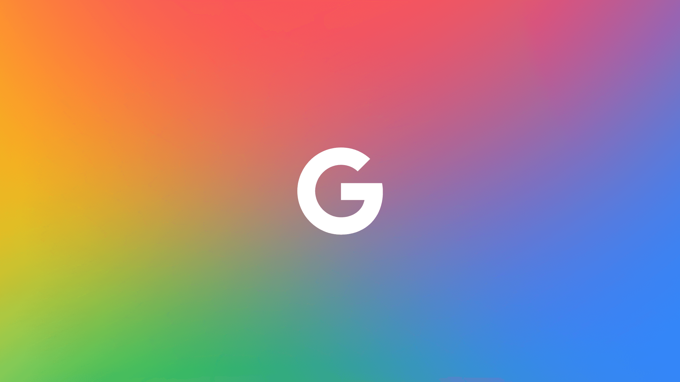
A new “G” with something to say
The core update is the transformation of the standalone “G” from four segmented colors to a continuous, fluid gradient. It’s a move from structure to flow, from fixed to adaptive. The design retains Google's recognizable palette; blue, red, yellow, green but instead of hard stops, these colors now blend like thought. Like data. Like software that learns.
There are also refinements to the geometry, tighter curves, improved balance, and better legibility across digital environments. Especially mobile, where scale matters and form has to work hard in limited real estate.
This wasn’t a visual indulgence. It was a systems-level upgrade.
Design that flows like the product

Back in 2015, Google embraced flat, minimal branding perfect for the material design era. But in 2025, branding has to do more. It has to feel smart. Adaptive. Intuitive.
The gradient “G” doesn’t scream innovation. It hums with it. It’s not trying to look futuristic. It’s trying to feel present — always learning, always responding.
The message isn’t “we’re building AI.” The message is “AI is already here — and it belongs in your life.”
Built for movement, not just meaning
This rebrand was never meant to sit still. Gradients perform in motion. They shimmer in onboarding flows. Pulse in product demos. Respond to light and space.
The new “G” wasn’t made for letterheads. It was made for screens. For gestures. For interaction.
If you’re a brand strategist, designer or agency leader, this is a signal. Motion isn’t an extra anymore. It’s the medium. Google knows that. And they’ve baked it into the system.
A system designed to unify
The new identity doesn’t stop at the “G.” It threads through everything; Search, Gmail, Docs, Maps, and more. It brings cohesion where there was once disconnection.
This is more than a cosmetic update. It’s Google visually affirming that Gemini isn’t just a feature. It’s the framework. The operating system for how all of Google’s tools now work together.
That new gradient? It’s not decoration. It’s glue.
Designed with real people in mind
One of the quiet wins of this rebrand is accessibility. The new visuals come with higher contrast. Smoother transitions. Better legibility. Whether you’re in dark mode, low vision, or just glancing at your phone, the system works harder for you.
It’s thoughtful design, not checkbox compliance. It reflects the kind of brand maturity that comes from understanding not just how users behave but how they feel.
A strategy in disguise
This rebrand isn’t trying to reinvent the wheel. It’s trying to align the chassis. The 2025 update shows us how to:
Connect brand and product through shared visual logic
Future-proof through flexibility, not reinvention
Guide perception with precision, not noise
Scale brand systems across static, motion, and interactive use
Google didn’t overhaul its identity. It tuned it. The result? A brand that now reflects what its products have become intelligent, integrated, and deeply embedded in everyday life.
Where brand meets brainpower
The new Google identity doesn’t try to be louder. It tries to be clearer.
It’s a brand tuned to micro-moments, the daily taps, scrolls, and searches that quietly define our relationship with technology. This isn’t about aesthetics. It’s about alignment.
For creatives building future-facing brands, this rebrand isn’t just instructive. It’s aspirational.
And if you’re rethinking how your own brand expresses clarity, cohesion, and character across screens, you’re in good company.
Sameness is building a better way to manage brand guidelines for the modern, motion-first era. It's a clean, interactive, WordPress-powered platform that you pay for once and own forever.
No subscriptions. No data lock-in. The future of brand documentation is here. It's built for users, not for awards. For longevity, not for trends. And that's what makes it smart. Explore what Sameness can do.