How Amazon’s quiet refresh became a masterclass in coherence
In 2025, Amazon unveiled its biggest brand update in over two decades. But this wasn’t just a new logo rollout. It was a strategic redesign of one of the world’s most recognisable brand ecosystems. Quietly ambitious, technically rigorous, and emotionally sharper, the refresh signals something much larger than a cosmetic facelift. It reintroduces Amazon to the world as a unified, culturally attuned, and emotionally intelligent global brand.
Let’s break it down using the only framework fit for a brand system this complex: what, why, when, where, who and how.
A softer smile, a stronger system

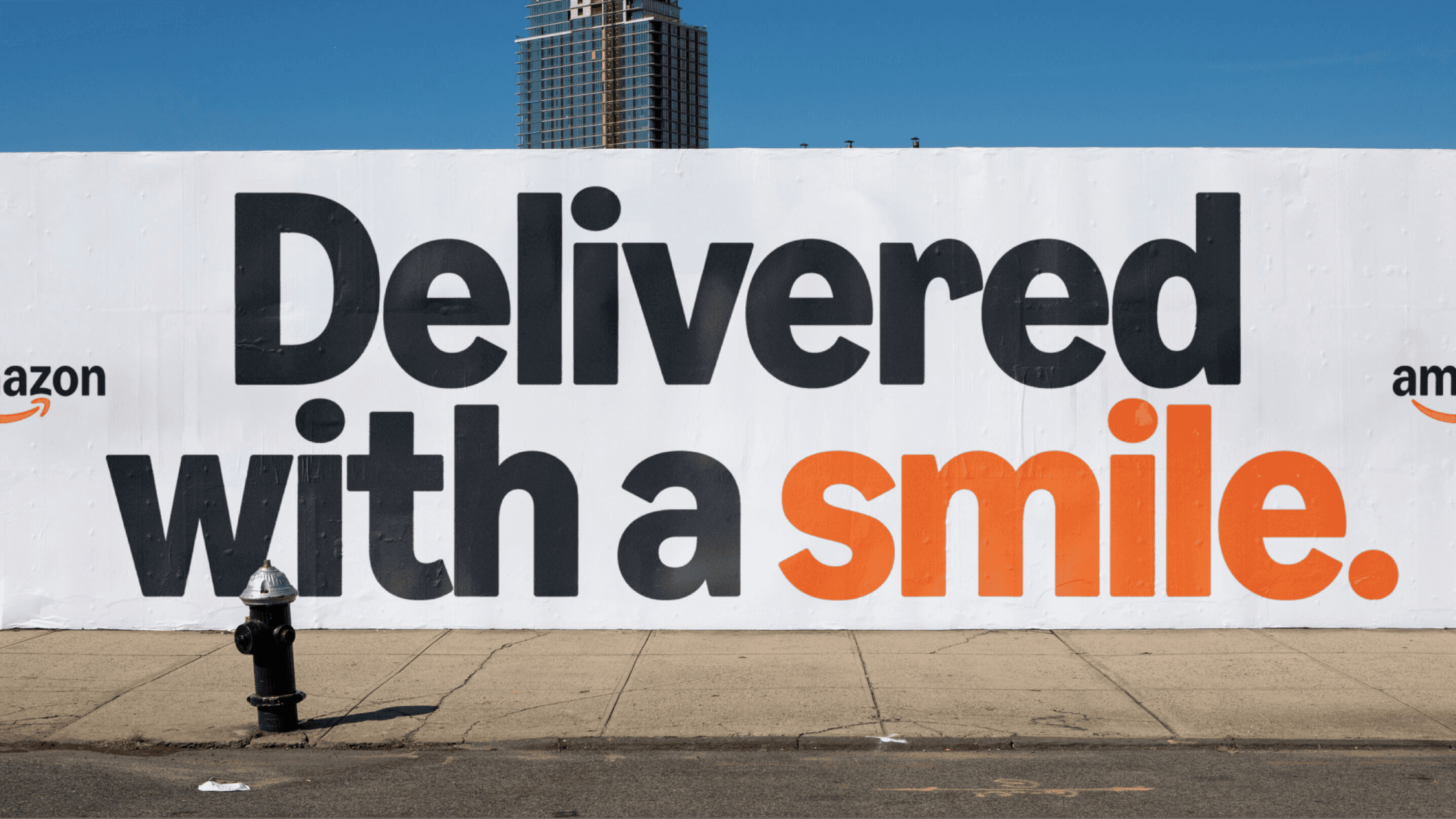
Amazon didn’t throw out the smile. It simply gave it more soul.
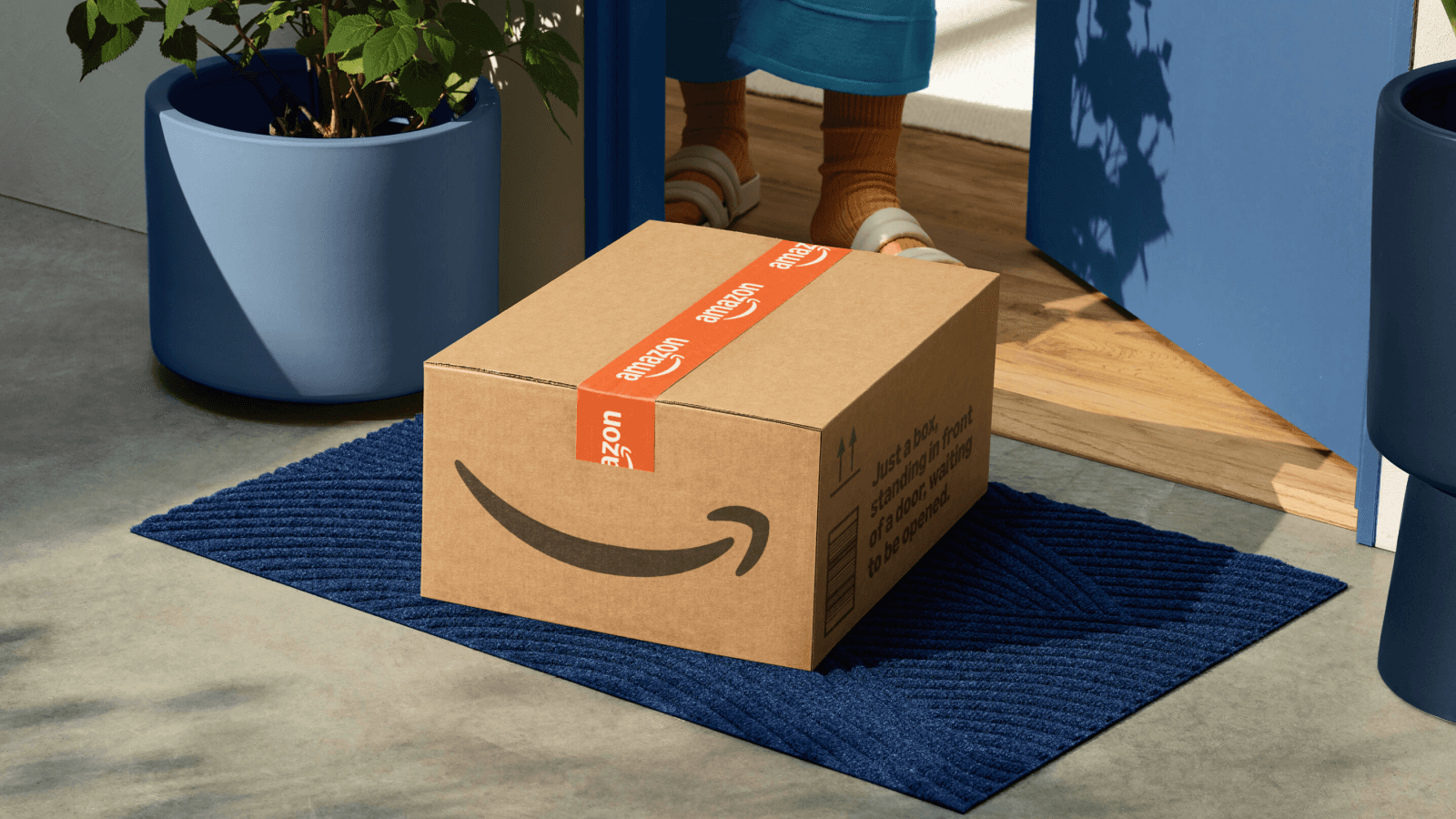
The famous arrow stretching neatly from A to Z is still there, but this time it’s fuller, softer, and drawn in a warmer, custom hue called Smile Orange. It’s not shouting for attention. It’s asking to be felt.
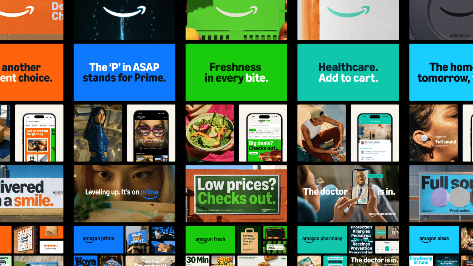
Beyond the smile, the whole system has been reimagined. Over 50 sub-brands from Prime to Fresh, Alexa to One Medical now sit inside a single, beautifully cohesive identity. Gone is the sea of mismatched arrows. In their place, a brand that finally speaks with one voice, even if it sings in different keys.
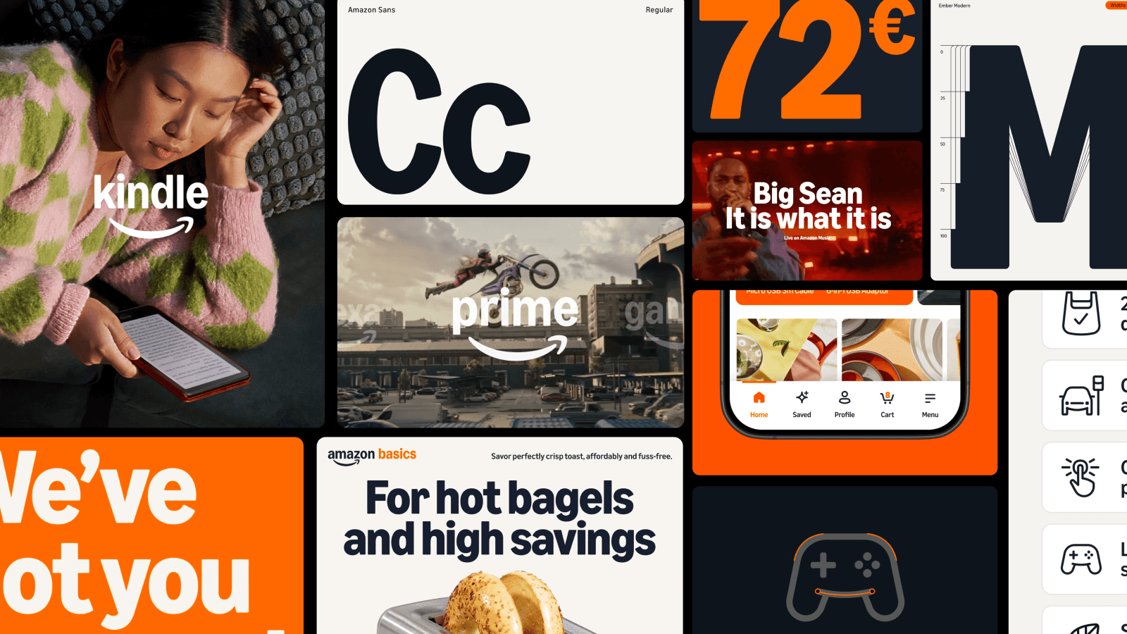
Typography got a total rebuild. Amazon Logo Sans holds down the logos. Ember Modern now supporting over 360 languages handles the rest. It’s flexible, emotional, and just restrained enough to serve everyone from streamers to pharmacists.
Every colour, every icon, every touchpoint is now aligned. It’s not minimalist. It’s modular. The difference shows.
From cluttered to clear: why now?
Amazon’s growth has been seismic. But visually? Scattered. The more it grew, the more fragmented its brand became. Sub-brands sprang up fast, each solving for its own design needs. The result? A patchwork of logos, styles and experiences that felt more functional than intentional.
This rebrand untangles the mess. But it also resets the tone. Amazon doesn’t just want to be seen. It wants to be trusted. The warmth of the new smile, the flexibility of the new type, the coherence of the colour system — it all signals a brand stepping into its next phase with more empathy, more clarity, and more emotional intelligence.
Rolling out quietly, changing everything

Softly. Subtly. The rollout began in early 2025 and continues to unfold across digital platforms, packaging, delivery vans, uniforms, and every corner of Amazon’s ecosystem.
There was no loud drumroll. Just a shift in how things feel. A friendlier app icon. A sharper box design. A clearer voice across regions. The best kind of brand update is the one that doesn’t need to be announced. You just notice it working.
One system, infinite surfaces
Everywhere Amazon lives. And that’s a lot of places.
From mobile screens to grocery aisles, from pharmacy boxes to Prime Video promos, the new identity adapts to wildly different contexts while staying unmistakably Amazon. Cohort structures group like-minded sub-brands by tone and audience, so the branding can flex for healthcare, hard tech, or entertainment without losing coherence.
Even the typography respects context. Ember Modern can be lively in a marketing campaign and neutral in a checkout flow. It’s that adaptability that lets the brand speak human, not corporate.
The team behind the transformation
The rebrand was led by Amazon XCM in partnership with Koto Studio. Over 18 months, they coordinated global teams, markets, and sub-brands into a single expressive framework.
Their solution wasn’t about streamlining for the sake of simplicity. It was about creating a design language rich enough to support complexity, diversity, and speed — without breaking down.
And they pulled it off. Because instead of asking “what should Amazon look like?”, they asked “what should it feel like?”
Built for complexity, designed to flex
Through structure, smart tools, and emotional clarity.
Sub-brands are now arranged in cohorts, creating order without sameness. Ember Modern speaks over 360 languages and handles everything from banner ads to health documentation with clarity and warmth.
Visual governance is now automated. A tool called [amazon]:name generates logos in line with the new system. Colours, icons, and typography work across sizes, cultures and surfaces. Smile Orange shows up like a thread through it all.
It’s infrastructure disguised as identity.
Where brand meets behavior
Amazon’s new identity doesn’t try to impress. It tries to connect.
It’s built for users, not for awards. For longevity, not for trends. And that’s what makes it smart.
For anyone working in branding today, this is a reminder that scale should never mean losing soul. And coherence doesn’t have to flatten personality.
Amazon just showed us how to be global, emotional, and brilliantly practical. All in one smile. If you're rethinking how your own brand operates across systems, screens and teams — you're not alone.
Sameness is building a better way to manage brand guidelines for the modern, motion-first era. It's a clean, interactive, WordPress-powered platform that you pay for once and own forever.
No subscriptions. No data lock-in. The future of brand documentation is here. It's built for users, not for awards. For longevity, not for trends. And that's what makes it smart. Explore what Sameness can do.