Resources / Introduction
Web Content Accessiblity Guide: Inclusive by Design
Designing for Everyone
A beautifully designed brand means little if people can’t use it.
Accessibility isn’t just a technical checklist—it’s a core part of modern brand experience. It ensures that everyone—regardless of ability—can engage with your content as intended. From a landing page to a social post to an interactive brand guideline, accessibility should be embedded into every touchpoint.
It’s also practical: accessible brands reach wider audiences, perform better in search engines, and reduce legal risk. This guide outlines what accessibility means, how it intersects with branding, and how to build it into your brand system with clarity and purpose.
What is Web Accessibility?
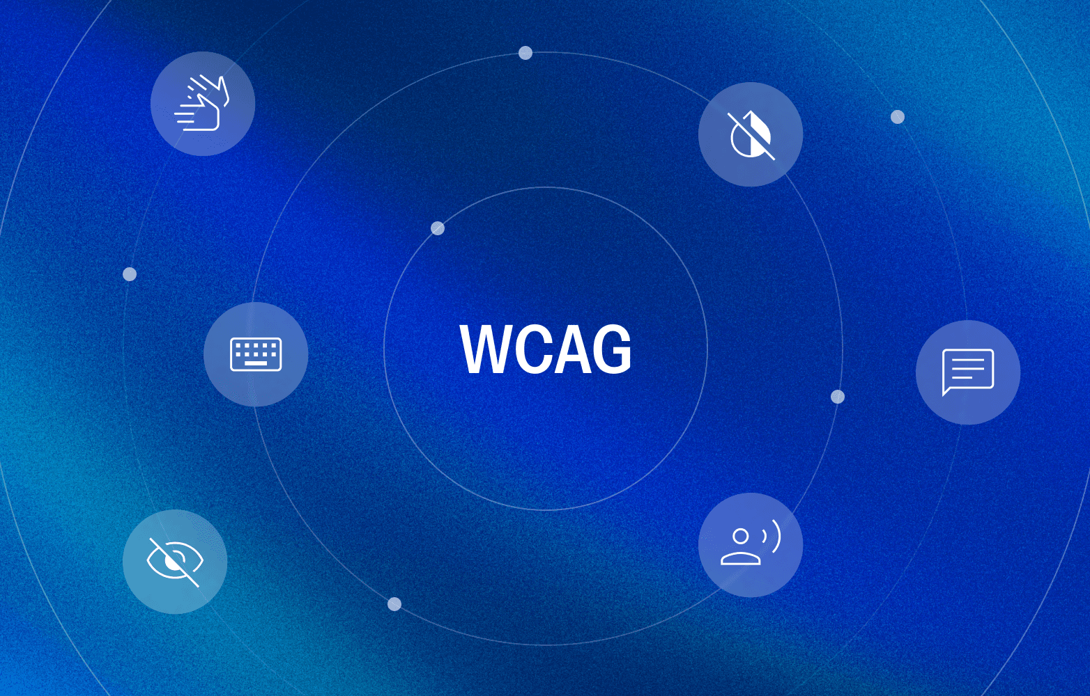
Web accessibility means designing digital content so that people with disabilities can access, understand, and interact with it.
That includes users who are:
Blind or have low vision
Deaf or hard of hearing
Mobility impaired
Cognitively affected
Or simply using technology in challenging conditions—like bright glare, slow connections, or without sound
Accessible design is inclusive by default, not exception. It removes friction and invites more people into the brand experience.
Who Benefits from Accessible Design?
Accessibility supports people with permanent disabilities—but it also benefits many more:
A parent holding a baby, navigating with one hand
A commuter browsing on mobile in poor lighting
A team member watching video content on mute in a noisy workspace
A user switching to dark mode at night to reduce eye strain
Inclusive design improves usability for everyone—not just a few.
Where Accessibility Meets Branding
Brand design choices have a direct impact on accessibility. Typography, color contrast, layout structure, and motion all shape how usable a brand becomes.
A brand system that looks visually polished but lacks basic accessibility will create inconsistent or exclusionary experiences. Color combinations might look great in a presentation but become illegible on mobile. Layouts may look beautiful but break keyboard navigation.
That's why accessibility should be considered a standard part of brand guidelines—not an afterthought.
Sameness supports this by enabling users to document accessibility best practices directly within their online brand guidelines.
The POUR Principles of Accessibility
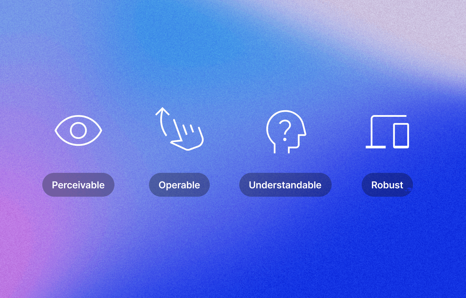
The POUR framework offers a simple, memorable structure for accessible design:
1. Perceivable
Can users see or hear the content?
Use high color contrast between text and background
Provide alt text for images
Add captions or transcripts for video and audio
2. Operable
Can users navigate and interact with content using a keyboard or assistive tech?
Ensure all functionality is keyboard accessible
Avoid hover-only content or interactions
3. Understandable
Is the content predictable, clear, and easy to follow?
Use consistent headings and clear language
Avoid unexpected interactions or confusing navigation
4. Robust
Will the experience hold up across browsers, devices, and assistive technologies?
Use semantic HTML
Follow best practices for responsive and accessible code
Test with tools like screen readers and browser extensions
Quick Brand Accessibility Checks
This checklist can be used when designing, reviewing, or updating brand assets:
Typography: Are fonts legible across devices and sizes? Avoid ultra-light weights and very small text.
Color: Does text meet a minimum contrast ratio of 4.5:1 against its background?
Alt Text: Are all images labelled with meaningful alternative text?
Headings: Is there a clear structure using H1, H2, H3, etc.?
Motion: Can animations be turned off? Are flashing or rapid sequences avoided?
Navigation: Is all content accessible via keyboard without requiring a mouse?
Tip for teams using Sameness: Create a dedicated “Accessibility” section inside your brand guidelines to document these standards clearly for internal and external collaborators.
Tools to Support Accessible Design
These tools can help evaluate and improve accessibility at every stage of the design process:
WAVE Web Accessibility Tool – Visual audits of accessibility issues
WebAIM Contrast Checker – Quick contrast testing
Axe DevTools (Browser Extension) – Deep accessibility diagnostics
Accessibility and SEO Work Together
Improving accessibility doesn’t just help users—it also supports performance. Many accessibility improvements directly benefit search visibility, including:
Clear heading structures
Meaningful alt text
Mobile-friendly layouts
Faster loading speeds
Semantic HTML and metadata
In short, search engines reward content that’s built for people.
Build Brands Everyone Can Use
In 2025 and beyond, accessibility is not a nice-to-have—it’s a must. It’s part of building thoughtful, inclusive, and future-ready brand systems.
Sameness makes it simple to embed accessibility into your brand guidelines from the start—so your brand is not only beautiful and consistent, but also usable by more people, in more situations.
Because great brands aren’t just seen or heard—they’re experienced.