Resources / Introduction
Color Combinations and Proportions: Balancing Brand Colors
Get the Balance Right
It’s one thing to pick a set of great colors. It’s another to actually make them work together. Even the best palettes can fall flat if the proportions are off or the colors clash in the wrong context.
This guide walks through how to create balance, build contrast, and use color combinations with purpose—so your brand looks consistent, intentional, and easy to work with across every touchpoint.
Why Color Proportions Matter

Color isn’t just a design choice—it’s a system. Without some logic behind how your colors show up and in what ratio, things get messy fast. One page might feel too loud, another too flat. You lose rhythm, clarity, and that sense of cohesion that makes a brand feel established.
Proportions help shape experience. They give your visuals structure. Done well, they:
Make layouts easier to read and navigate
Reinforce hierarchy and call attention where it’s needed
Maintain a sense of visual calm—even with bold palettes
Make it easier for others to apply your brand consistently
The right balance lets your color palette breathe.
The Roles Colors Play in a Brand System

Not every color in your palette should compete for attention. That’s where defining roles comes in—it’s one of the simplest ways to create clarity.
Primary Colors
These carry your brand’s identity. They show up most often and usually sit at the core of your UI, logo, or headlines.
Secondary Colors
These add flexibility. Great for variety across channels—charts, background blocks, illustrations, etc.—without breaking your system.
Neutrals
They’re the quiet ones—backgrounds, type, spacing elements. They help create contrast and make your primaries pop.
Functional Colors
These are utility players: error states, warnings, success messages, active links, status badges. They should stand out—but always in a consistent way.
Define these roles in your brand documentation. When color use is left to guesswork, things break down fast.
How to Combine Colors That Actually Work

Here’s where most palettes go wrong: they look good on a slide deck, but fall apart in real use. The key isn’t just picking colors that look nice—it’s understanding why they work together.
Start with contrast and harmony.
Use tools like color wheels or generators to build your palette using tested combinations:
Analogous
Colors that sit next to each other (e.g., blue, teal, green) – soft and cohesive.
Complementary
Opposites on the wheel (e.g., orange and blue) – punchy and high contrast.
Split Complementary
One base color and two from the opposite side – a balanced, less aggressive contrast.
And always test for accessibility. A perfect combo means nothing if it’s hard to read. Use tools like WebAIM to check your contrast ratios for buttons, text, and links.
Optional visual: Palette swatches showing different combinations in context
The 60–30–10 Rule (And Why It Works)
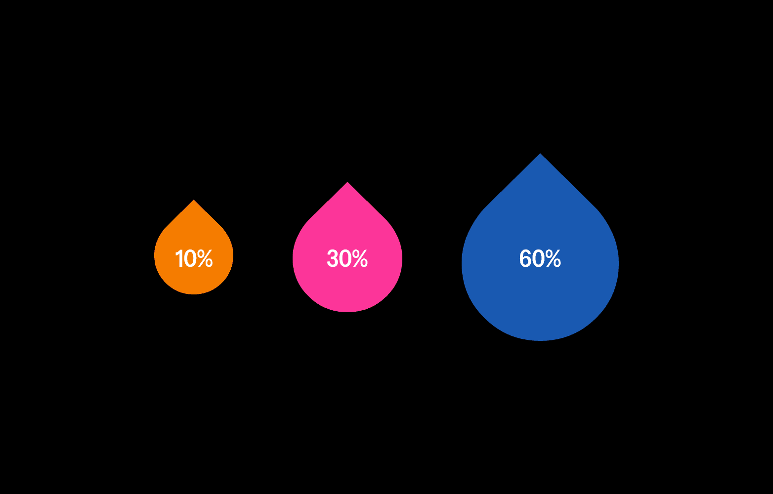
One of the easiest frameworks to create color balance is the 60–30–10 rule. You’ll see it everywhere from interior design to branding, because it just works.
60% Dominant Color
This creates your backdrop and overall mood—think section backgrounds, surfaces, or whitespace.
30% Secondary Color
Used to add structure and visual interest—like headings, dividers, or image overlays.
10% Accent Color
This is your attention grabber—buttons, links, callouts. Use sparingly for impact.
Depending on your brand’s tone, you might adapt it to:
70–20–10 for minimal, airy systems
50–40–10 for more energetic, content-heavy layouts
The idea isn’t to be rigid. It’s to give every color a clear job—and the right amount of space to do it well.
How to Document Proportions in Your Guidelines

Defining proportions is just as important as choosing colors. Here’s how to make it clear for your team or collaborators:
Show color use in actual layouts, not just swatches
Include “do” and “don’t” examples (e.g., overuse of accent colors or grey-heavy interfaces)
Break it down by format—UI, social, motion, print
Document light and dark mode variations separately, if you support both
Use before/after mockups to highlight proper balance
Optional visual: Side-by-side examples showing correct and incorrect application of brand colors
Tools to Help You Get It Right
Download:
Color Ratio Cheat Sheet (PDF)
Try:
WebAIM Contrast Checker – test for accessibility
Adobe Color – explore combinations and harmonies
Material Palette – useful for interface-first brands
Use Less, But Use It Well
You don’t need a dozen colors to build a strong brand—just a handful used with clarity and intention. A few defined roles, some real-world examples, and a bit of ratio planning go a long way.
And remember: proportion adds just as much meaning as the colors themselves. The same green can feel calming, urgent, or even overwhelming depending on how much you use it and where it appears.
The takeaway? Define your colors. Use them with purpose. Document them well. That’s how color becomes a reliable, scalable part of your brand—not just a visual decision.