Type is doing the heavy lifting
Typography has always done more than just fill space. It sets tone. Signals personality. Shapes the way a brand speaks—before a single word is even read.
And in 2025, type is doing more of the heavy lifting. As brands shift toward stripped-back, text-first design, typography is stepping up—flexing harder, moving smarter, and taking center stage across digital experiences.
So, what’s changing? And how do you keep your brand looking and sounding like it belongs in the now?
Let’s get into it.
Text is having a moment
In a world full of color, noise, and endless content, it’s the quiet confidence of typography that’s cutting through. A single, perfectly weighted wordmark. A snappy line of bold, kinetic copy. A title that breathes because it’s been given room to.
The best brands know this: when the type is right, you don’t need much else.
Typography trends leading the charge in 2025
Credits — richprjcts x Gradient Type
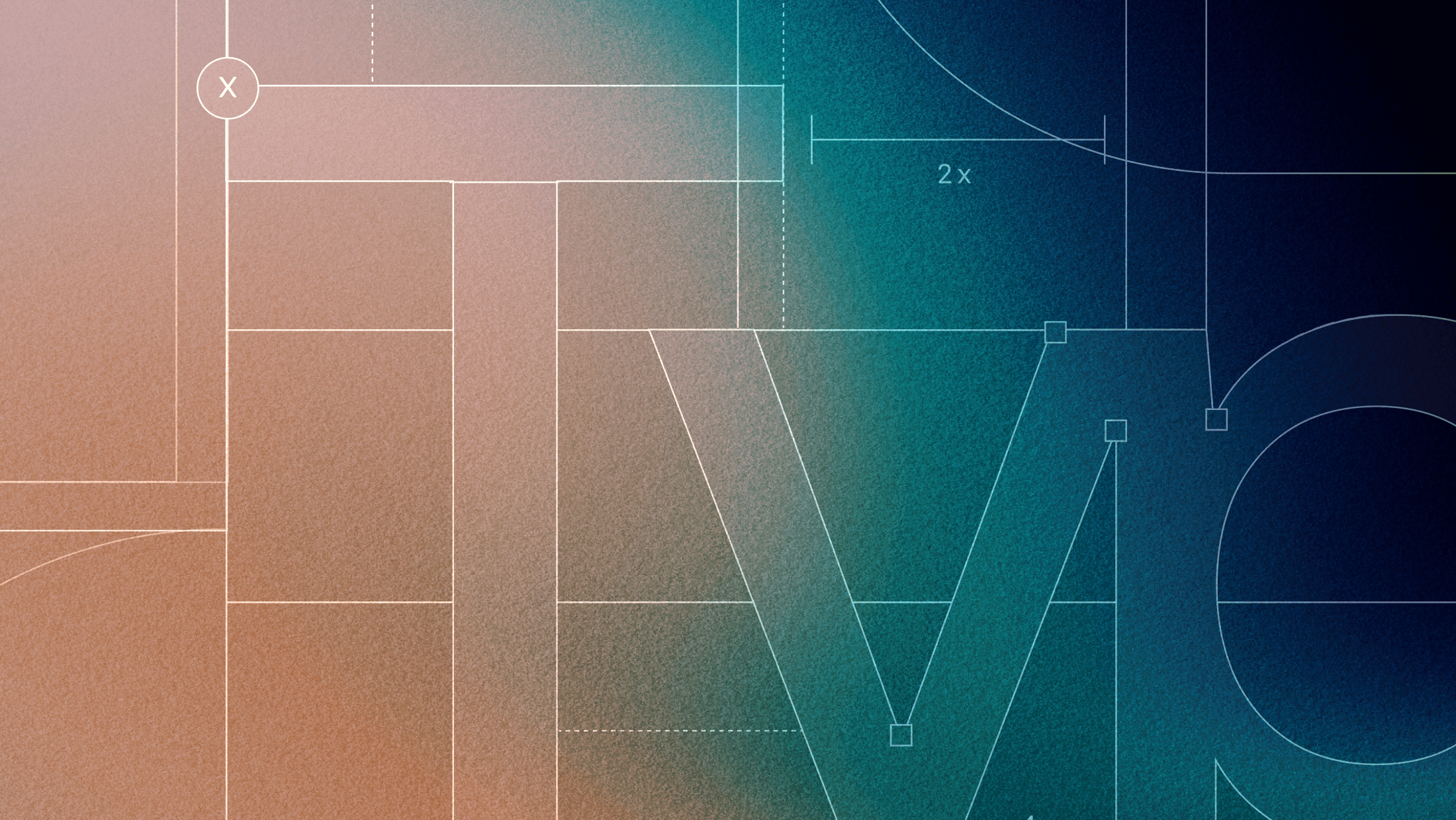
1. Kinetic type is no longer optional
Forget static rules. The smartest brands are treating motion as part of their typography system. From website headers that slide into place to app UIs where text pulses, glides, or responds, kinetic type is shaping how brands are experienced—not just seen.
Why it matters: Motion adds personality. It directs attention. It tells your brand story without needing a paragraph. Dropbox, Cash App, and Spotify are all building this into their brand systems—and making it feel effortless.
2. Variable fonts are finally everywhere
Variable fonts have been around for a while, but 2025 is the year they go from nice-to-have to non-negotiable. One font file. Multiple axes of expression. All the flexibility without the bloat.
Why it matters: They’re faster, lighter, and adapt across screens, platforms, and tone. And when your brand needs to scale globally or shift tone mid-scroll, that kind of flexibility pays off.
3. Brutalist type is back—but with polish
Oversized. Unapologetic. Functional to the point of aggressive. Brutalist typography is making its way back onto the grid—but this time with better rhythm, smarter spacing, and more balance.
Why it matters: It’s not just about being loud—it’s about showing confidence. For brands looking to feel bold, disruptive, or deliberately anti-slick, this is the move.
4. Imperfect is the new premium
With AI-generated everything flooding the feed, raw and handmade are standing out. Think loose kerning, wobbly baselines, or type that looks like it’s been drawn instead of dropped in.
Why it matters: It feels human. Emotional. And in a world of perfect pixels, imperfection stands out as a sign of authenticity.
5. Monospaced and retro-futurist fonts are having fun again
Type that feels like old terminal code or ‘90s desktop apps is popping up in surprising places—especially when paired with slick layouts and soft palettes.
Why it matters: It hits the sweet spot between nostalgia and newness. And it speaks fluently to Gen Z and millennials raised on early internet aesthetics.
So what does this mean for your brand guidelines?
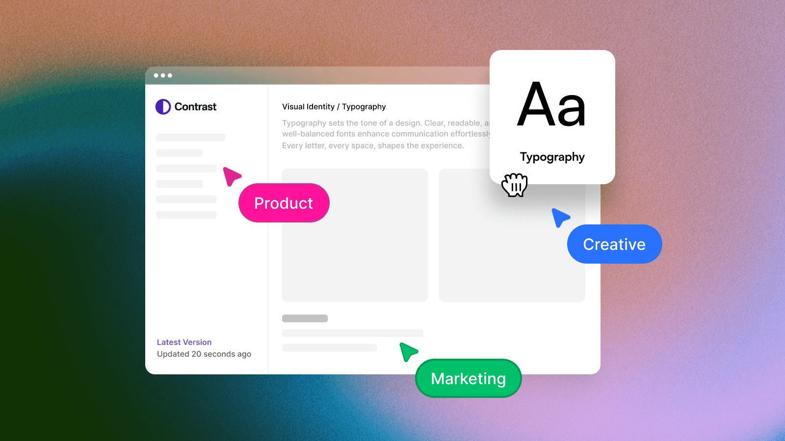
Typography is no longer just a design decision—it’s a brand experience. Your type needs to scale. Animate. Shift tone. And show up with clarity whether it’s in motion, on mobile, or mid-scroll.
That’s why the best brands are building dynamic, responsive typographic systems directly into their guidelines. And not on static PDFs—on platforms designed for real-time design.
You need:
Motion rules baked into your type styles
Guidance on using variable fonts across tone and context
Previews that show how type behaves in real applications
Flexibility that doesn’t break the system
Typography has always been powerful. But in 2025, it’s also responsive, expressive, and alive.
If your brand’s guidelines still treat type as a static afterthought, you’re already falling behind.
Future proof your brand guideline
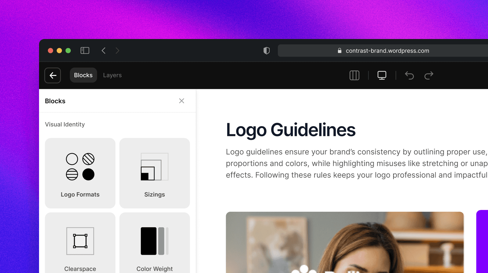
Sameness is building a better way to manage brand guidelines for the modern, motion-first era. It's a clean, interactive, WordPress-powered platform that you pay for once and own forever.
No subscriptions. No data lock-in. The future of brand documentation is here. It's built for users, not for awards. For longevity, not for trends. And that's what makes it smart. Explore what Sameness can do.