Branding on the Final Frontier
Space isn’t just the final frontier—it’s now the newest battleground for brand identity. Rocket launches are livestreamed, billionaires are in the pilot seats, and logos carry almost as much weight as lift-off. We’re in the age of space storytelling, where mission patches and mottos work just as hard as fuel tanks and flight software.
Blue Origin, Jeff Bezos’ brainchild since 2000, isn’t just a company trying to leave Earth—it’s building a mythos. With meticulous branding and a tone that whispers rather than shouts, Blue Origin walks the delicate line between engineering ambition and cultural resonance. But as the rockets rise, so too do the questions.
Gradatim Ferociter: Blue Origin’s Brand Ethos
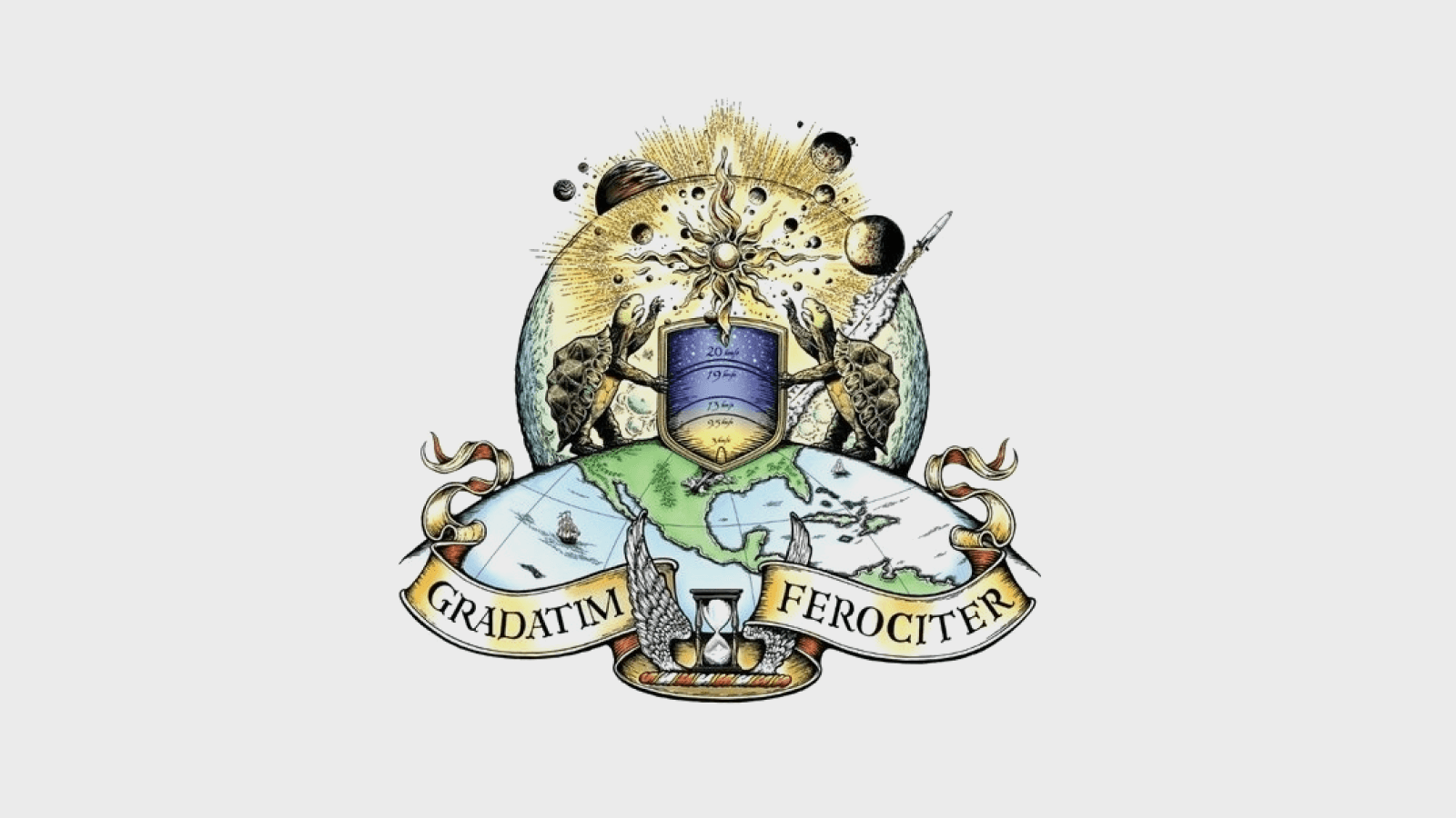
Forget flashy slogans or buzzy taglines. Blue Origin builds its identity around a Latin phrase that’s more philosophy than promo: "Gradatim Ferociter"—Step by Step, Ferociously.
Not exactly TikTok-friendly, but deeply on-brand. Bezos reportedly had it scrawled across every whiteboard in Blue Origin’s early days. It's not just an ethos—it's a mission protocol.
While SpaceX zigs with drama and disruption, Blue Origin zags with calm deliberation. The message? "We don’t chase speed. We chase precision."
Even the company’s mascot is a tortoise—not metaphorical, but literal. Bezos himself once explained: "Slow is smooth and smooth is fast." (Transcript)
And let’s not forget the winged hourglass on the company crest. A Victorian cemetery symbol meaning time is fleeting. Even their insignia whispers: "Move carefully. But don’t dawdle."
A Feather in the Void: The Logo That Floats

While other space companies go all-in on orbital rings and sci-fi glyphs, Blue Origin chose a feather.
Elegant. Understated. Unexpected.
Bezos calls it a tribute to the perfection of flight. But more than that, it evokes freedom, exploration, and lightness. It says: we don’t need flames to make an impact.
The early logos felt a bit try-hard—mechanical typography trying to convince you of its credibility. But over time, the logo matured. The feather got more refined. The type more confident.
The brand stopped trying to prove it belonged in space. And just acted like it did.
A Velvet-Toned Digital Presence
Head over to BlueOrigin.com and you’re not greeted by countdown clocks or promo banners. Instead, you get mood. Atmosphere. Deep-space vibes.
A palette of navy and black that feels like the cosmos itself
Sparse typography that doesn't scream, it suggests
Just enough motion to feel alive, but never chaotic
It feels more like walking through an exhibition than browsing a corporate site. Blue Origin doesn’t sell you on the tech. It seduces you with vision.
This isn’t a call to action. It’s a call to belief.
When Fashion Meets Flight: The Balmain Backlash

Now for the PR turbulence.
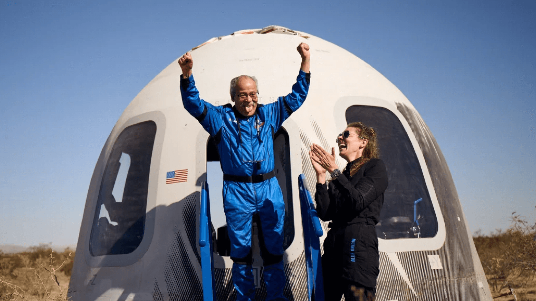
On April 14, 2025, Blue Origin made headlines with its first all-female space crew. The team included big names like Katy Perry, Gayle King, and Lauren Sánchez. The twist? They flew in designer space suits.
Cue the firestorm.
Critics pounced. Was this a feminist milestone or just high-gloss spectacle? Was it progress or just performative branding in zero gravity?
The flight was short (11 minutes). The ship was automated. And the reaction was loud (HuffPost, BuzzFeed).
"Pop feminism in a pressure suit." "The defeat of American feminism." "A glorified amusement park ride."
Meanwhile, the crew clapped back. Gayle King declared, "I’m not going to allow you to diminish our joy." Aisha Bowe highlighted the wave of messages from inspired girls. Sánchez invited critics to come see the engineering up close (Today Show).
But the drama didn’t end in orbit. As the capsule touched down in the West Texas desert, a moment meant to cap the mission with inspiration veered into meme territory. Jeff Bezos was filmed dramatically opening the capsule hatch to welcome the crew back to Earth—but eagle-eyed viewers noticed something odd. Footage revealed the hatch briefly cracked open from the inside before being shut again, seemingly just before Bezos swung it open for the cameras (Standard).
Cue conspiracy theories and Twitter threads. Some questioned whether it was staged for optics, a Bezos-branded moment of symbolism. Others defended it as procedural theatre—a ceremonial gesture, not a deception. NASA later confirmed such hatches can be opened from either side, but the incident became a viral micro-controversy that only deepened the conversation around how tightly orchestrated Blue Origin's brand moments really are.
The result? A branding paradox: one small step for visibility, one giant leap into controversy.
Sustainability: Sky-High Claims, Grounded Concerns
Blue Origin likes to frame its rockets as clean machines. The New Shepard burns liquid hydrogen and oxygen. The only emission? Water vapor. Sounds great on paper.
But experts aren’t sold.
Water vapor in the stratosphere can trap heat and erode the ozone.
Nitrogen oxides formed during high-heat combustion? Also not great.
Hydrogen production is energy intensive. Unless it’s green hydrogen (it rarely is), emissions are just hidden upstream (National Insider, Unilad).
And then there’s the question of value. Is an 11-minute joyride for celebrities really the best use of planetary resources? Some critics call it spacewashing—polishing the optics while ignoring the footprint.
Worse still? Allegations that internal sustainability concerns are often waved off as PR problems, not engineering ones (Space.com).
Turns out, even eco-astronautics comes with fine print.
Legacy vs. Virality
Blue Origin isn’t built for virality. No Musk tweets. No livestream drama. No memes. It’s more C.S. Lewis than Elon.
But that doesn’t make it bulletproof.
Whether it's fashion statements or carbon claims, stepping into public narrative means stepping into critique. The brand's quiet elegance works—until it brushes up against louder expectations.
Still, there’s something enduring here. A slow-burn brand in a hype-fueled industry. A company more interested in mythology than market share.
And that, in its own way, is radical.
Final Descent: Branding in Orbit
Blue Origin has built something rare: a brand that doesn’t beg for attention but earns it through consistency, symbolism, and restraint.
But in today’s culture of call-outs and contradictions, even the most carefully orchestrated narrative will face turbulence.
In the new space race, your rocket isn’t the only thing under pressure.
In orbit, every move is magnified. And branding, like atmosphere, is thinner than it looks.
Future proof your brand guideline
Sameness is building a better way to manage brand guidelines for the modern, motion-first era. It's a clean, interactive, WordPress-powered platform that you pay for once and own forever.
No subscriptions. No data lock-in. The future of brand documentation is here. It's built for users, not for awards. For longevity, not for trends. And that's what makes it smart. Explore what Sameness can do.